While many wine marketing agencies (including this one) offer extensive digital marketing audits that help wineries sell more wine online, sometimes all a winery really wants is a quick assessment of their website, just to see if there are any glaring errors that could easily be fixed.
In that spirit, we have created a list of ten winery website audit checks that you can perform, on your own, to see how your website is doing, and what can be done to make it into a more effective sales tool. Often, the fixes are easy, and can be done by you. Some may require the help of your web designer, but those changes should be pretty easy for them to perform. And, of course, there are more – these are just the ones we found have the most profound impact when implemented AND have fairly easy fixes.
So, without further ado, let’s audit your website.
1. Website Speed and Health
Why it’s important:
The faster and healthier your website, the more Google likes it. The more Google likes your site, the higher it will rank it.
How to check:
Google Search Console is the go-to tool for web developers to check on website health. However, it can be hard to interpret for those who aren’t web savvy. If that’s your situation we recommend using a mix of Google’s PageSpeed Insights, Pingdom, GT Metrix, and Power Mapper to see how our sites are doing. Be warned, PageSpeed Insights will make you feel pretty bad about the speed of your website on mobile (we have yet to see a winery website score above a 60 on mobile), but you should be able to hit the 90s on Desktop. On Pingdom, we like looking at the Page Size, and aim to get that well below 1M. You should aim for an A (maybe a high B) on GTMetrix. Finally, on Power Mapper, you want to make sure your website isn’t throwing any errors, as Google hates errors.
What to do:
All of these tools will run reports that you, likely, won’t understand – which is why people who offer free/low-cost audits love them. They show you how slow your website is, and tell you they can fix it. Sometimes they can – sometimes they can’t – but here are a few tips for improving speed/health:
1. Don’t put a video/slider on your homepage.
2. Make sure your images are optimized (you should be using .webp image files, instead of .jpgs, .pngs, or .gifs, as they are much, much smaller).
3. If your site is built on WordPress, install WP Rocket, which will help you identify/remove/minify code you don’t need.
4. Don’t put someone in charge of updating your website who doesn’t know how important number 1 and number 2 are (number 3 is forgivable, but should be used if you can).
5. If you have errors, ask your web developer to try to fix them. Sometimes they can, sometimes they can’t (particularly if it’s the store that’s throwing the errors, which can happen). If that’s the case, minimal errors is the goal.
2. Quick SEO. Search your site on Google
Why it’s important:
When your website looks good on search engines, people are more likely to visit it.
How to check:
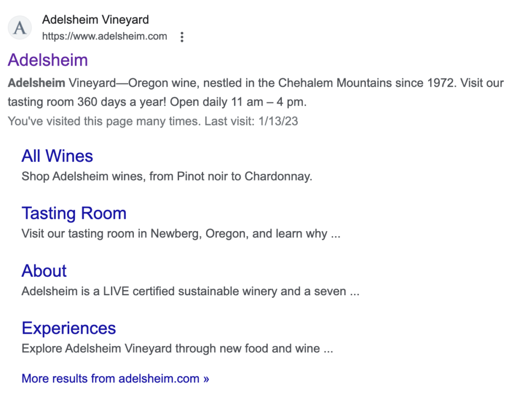
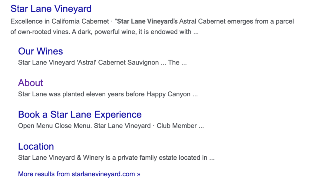
Enter your winery’s name into Google. First, you are looking to see if the Google My Business listing (the information block on Google with images, reviews, hours, events, etc.) has accurate and updated information. Next, check to see that you are the first organic website to appear (if you’re not, you have a SEO problem – which all of this helps with). You are also looking to see if your website lists pages in a nice way, with well-written descriptions, or if it’s pulling random text from the pages.
Nice, well-written descriptions, full of keywords. Intentional in what they want they want the user to know about each page.

Random text pulled from the pages of the site (including the open menu prompt):

What to do:
1. If Google My Business isn’t showing accurate information, update it.
2. If your descriptions aren’t well-written, or are pulling random text from the page (frequently the first line of text), make sure your description tags are filled out. We like using Yoast SEO on WordPress (it also generates a site map, which is important for SEO). Most other web builders (Craft, SquareSpace, etc.) have their own SEO plugins where you can do this. Also most winery eCommerce software options have description fields that can be filled out on a page by page basis. As you write these descriptions, make sure you are using good keywords, as Google weighs descriptions pretty heavily when it comes to search rankings (SEM Rush is a good and free tool you can use to guide your keyword opportunities).
3. Search Your Wines
Why it’s important:
You want your wines to appear when people search them, so they buy directly from you, not somewhere else.
How to check:
Type the full name of one of your wines into Google. You want the search result to look like this:

Make sure what it finds isn’t a page outside of the store, but the actual product, itself. This can be challenging with Commerce 7 stores, as the pages are generated dynamically (although it can be done, as Foris is a client of ours on Commerce 7).
What to do:
1. Make sure to include your brand’s name in the naming of your wine. Calling something “2020 Pinot Noir” doesn’t help.
2. Fill out those description tags on your wine pages.
3. Add a sitemap with your products to Google Search Console.
4. Add your products to Google Merchant Center (BTW, we have a tool that does this automatically for Commerce 7. For details, contact us).
4. Mobile Usage
Why it’s important:
Because the majority of people who visit your site do so on a mobile device, and you need to make sure the mobile experience is just as easy as the desktop experience.
How to check:
Pull your website up on a phone AND tablet. Check to make sure the navigation is easy to use. Make sure fonts are easy to read. Explore the store to make sure it’s easy to navigate.
What to do:
Depends on what you find. But, if any part of your mobile usage is problematic, let your designer know.
5. Different Browser Usage
Why it’s important:
We recently had a client have us audit their new website, which wasn’t performing as well as expected, and we discovered one reason for this was because the way the designer had installed the Commerce 7 cart made it not work on Safari browsers (including on iOS devices). The winery had no idea that this was happening. We got it fixed, and immediately saw sales go up.
How to check:
Pull your website up on different browsers. You can see what browsers people use on your site in Google Analytics. They are, most likely, Chrome, Safari, and Firefox. Explore your site with these different browsers, and go through the purchasing process to make sure there are no problems there. Don’t forget to test out multiple browsers on your phone, too.
What to do:
If there’s anything that isn’t working, let your designer know.
6. Navigation
Why it’s important:
You want people to easily navigate to your store and wine club sign up.
How to check:
There are tools you can use in GA4 to really drill down on this, but, for ease, just go to your website and pretend to use it as a first time user. Does it take more than a split second to figure out where to shop your wines? How about where to sign up for club? Contacting you?
What to do:
1. Use basic language that is familiar and stands out to the user. You’d be surprised how much using “Acquire” in your navigation vs “Shop” or “Wine” causes user friction and fewer store visits.
2. People read menus, like text, left to right, so put the most important links to the left. The only exception is if you have a CTA button on the right – which we have been doing lately, and has effectively landed people in stores.
3. Make sure there are links to important pages in your footer, too.
7. Home Page / Messaging
Why it’s important:
This if often the first page people see when visiting your website. There’s some important information that should be there, and this is the place to kick off your message.
How to check:
Again, look at your home page from the perspective of a new user. You’d be surprised how looking at your website through new eyes will reveal holes. We’ve audited websites where the user would have no idea what state the winery is in, let alone what AVA. Is there a product image on your homepage? There should be. Also, is there anything on your home page that separates you from your competitors? Is your messaging obvious?
What to do:
1. If missing, add to your homepage: location, AVA (and sub-AVA), varietals produced, bottle images, a photo that is unique (we love a good drone shot, but don’t love them on the homepage as they don’t speak to the consumer – particularly because they are so commonplace, and the consumer can’t see the difference between yours and the dozens out there just like it). That first image should be uniquely yours – whether that means a great product shot (so people know your branding immediately), an image of people enjoying a tasting (so consumers can see themselves there), a family photo (if a family winery and the family interacts with visitors), something that expresses your message.
2. If your messaging isn’t obvious, make it so. Are you all about sustainable growing? Family? Affordable luxury? Expensive luxury? Do people know that right away? If not, fix it.
8. Store
Why it’s important:
This is where people decide to buy. It needs to be as easy of a purchasing process as possible. If it’s at all difficult, you may lose out on buyers. Unfortunately, wineries are at the mercy of the eCommerce software they are using for a lot of the checkout process, but there are things that can be done to help.
How to check:
Shop your store. See if it’s easy to find a specific wine. Make sure each wine has a page to itself and that page is filled out fully (good bottle shot, tasting notes, scores, etc). Get creative with your categories. Sure, break them down traditionally, into groups like Red, White, and Sparkling, but throw in some like Current Flight, Best Selling, High Scoring, Club Shipment, Club Exclusives, Organic, etc.
Check out. Do you have a carrot message in your shopping cart, encouraging people to add on to get the right discounts, or whatever message you want them to have?
What to do:
See above. Since you can’t do much about the checkout process, make sure you have your contact information easily accessible.
9. Club
Why it’s important:
You want people to sign up for your club. Your club page needs to make that happen.
How to check:
Check your Club page. Has it been updated recently? Club is often the lifeline of wineries – so we like to see a lot of extra love on these pages. Club should NOT be a set it and forget it page. It should be updated regularly. For example, we like to have a subhead under each club that says, “Next Shipment: September 2023”, so people can quickly scan to see when the can expect a shipment if they buy today (if there’s not a shipment coming soon, can they expect any sort of welcome package?).
People also like to know an approximate cost per shipment. We know this can be challenging, but it makes a difference in online sign-ups, and whether or not people will click the button to join.
Some people like it when wineries select wines for them, others want a custom option. For best results, have both.
Clearly list benefits of your clubs on this page. Go beyond discounts. Exclusive offers. Shipping. Remember, many of those buying online are buying from out of town. How do you balance out the free tastings locals often get with benefits for out of town members?
Finally, because it’s harder to sell club online than it is in the tasting room, consider lowering the buy in – maybe as an online exclusive. After all, once you have a club member, it’s pretty easy to get them to upgrade.
Once you’ve assessed all of this, try to join your club online. Again, make sure there aren’t any snags that would stop someone from signing up.
What to do:
There are plenty of tips above. Decide what you want to implement and do so. That said, the priority is in making sure it’s an easy process to sign up for a club – so be sure to have your contact info easy to locate.
10. Message Bar (Annnouncement Bar)
Why it’s important:
Let me start by saying we aren’t going to share all of the tools we like to add to a website to give it our special Lunabean Secret Sauce, BUT, as our last tip, we do want to share one of our favorites: The message bar.
We LOVE a message bar (that bar above navigation that shares a message – or announcement – across all pages). Not only does it quickly get a message across, but it’s important to use anytime you are running promotions, or have an event coming up that you want people to know about. We so often see wineries send emails or post on social media some sort of promotion, but, when you go to the website, there’s no indication of a promotion. A message bar reminds those users of the exact nature of the promotion (how many bottles they have to buy, coupon codes they have to use, what wine is being featured, etc.), and it is a quick way to show the promotion to people who just visited your website without being led there via email or social media.
Even if you don’t offer promotions, those message bars are excellent drivers of traffic to places you want them to go. Have a club shipment coming up? Use that message bar to let people know, and that now is the time to sign up. Simply want to drive email leads? Message bar. Winery closed due to snow? Message bar. Again, message bars are THE BEST.
How to check:
Is there a message bar at the top of your site? If the answer is no, you don’t have one. 😉
What to do:
Easy. Get a message bar. WordPress has plenty of free message bar plugins (although, you might want to upgrade to paid options). Squarespace has them on their business plans. Last we checked, WineDirect does not have a message bar option, but many developers (including us) can create them for you.


