The new Facebook Pages are easier to organize, and easier for users to take in. It’s like seeing a cluttered and over-designed website go to something simple and easy to use. As web designers, it makes us breathe easier.
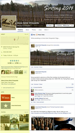
Now, none of our clients’ Facebook Pages have been flipped yet, so we can’t get into the nitty-gritty of new options, BUT, we can look at a page like Anne Amie’s and tell you what we see.
Click Here to View Anne Amie’s Facebook Page
First and foremost, note the the left side of the page is where all of the “Information” is. The right side is where your updates are. So much easier to take in, immediately.
Also notice, when you scroll down and get to the bottom of the left “Information” side, the page stops and only the updates scroll. This means that your info on that left side is going to be more important than ever, because that’s the thing that is going to remain static.
So, let’s take a look at the left side, and let me give you a few tips I see at first glance. Please, keep in mind, I do not know at this time if we can reorder that left side, or what the limitations are on that left side (can we show off ALL of our apps, or just a couple?).
About Box:
In the top half of the About Box, we see the map, phone number, and hours. Make sure this is all accurate, as it’s going to be the first thing people take in.
The bottom half of the About Box shows off your Likes, Ratings, and Check-Ins. It’s the “popularity” portion. It’s not fair, but the prospective customer judges your business by it, which is why it’s important to encourage people to rate and check in to your business. It also tells the user if they have Friends who Like this page (making it significantly more likely THEY will, also, Like the page).
BUT, my favorite part of the About Box is the portion where you get to say something about your business. I don’t know what the character limit is here, but try to get in some good search words, as, I imagine, Facebook will be weighing this box heavily in its own internal search engine. As soon as we know the details, we will get them to you, as this About is POWER.
OH, also a huge fan of a nice website URL display. Make sure yours is correct.
Apps:
Notice your App cover images have moved from the top (beneath the Cover Photo), to this box on the left side. LOVE THIS.
The Apps were getting lost at the top and weren’t being used as they should have been. We think this will help improve that, because Apps can be powerful. We love Contests, Instagram Feeds, E-Mail Newsletter Sign-Ups, Pinterest Feeds, Eventbrite Ticket Sales — all of these can be done with Apps (and so much more). But, if no one is clicking on the Apps, then they don’t help much, do they? Hopefully this will help improve that.
Your job (and ours, as we are also guilty of this), is to take this time to remove some of your outdated Apps…because they might just find themselves on display when your Page flips. Did you run a contest last Christmas that is now in hidden? It might not be hidden when the page flips. Clean them up!
Photos:
A nice display of your latest 9 photos (not just your 1 most recent photo). The user clicks one that catches their eye, and the photo blows up and the description is there. Meaning photos (and their descriptions) just got a lot more important.
Videos:
A whole section for videos. I LOVE THIS! Before, videos were easily lost among photos. Now, they get their very own section, meaning more people will see them! Show off more video tasting notes!
Upcoming Events:
Yes, yes, yes! A great little calendar of your events. People no longer have to click an App at the top (which may or may not be hidden). It shows off your latest events right there. A great way to show off what is happening at your winery.
So, before the flip, fill out your Events Calendar. You’ll love how it looks when the changes come.
This would be my favorite update, except for…
Notes:
Notes were nearly thrown away in the current incarnation of Facebook Pages, which is such a shame, as they are a great way to communicate with your audience.
Notes are like blog posts, where members of your team can share information that will further connect you to your audience. They are longer than updates, and are now properly highlighted, to stay in front of your audience for as long as you want them.
Your goal is to clean up your old Notes. Because Facebook devalued Notes, people forgot about them and few have updated them. Write a new Note, and you’ll be ahead of the pack. And give it a title that will make people open it up. I, for one, will be copying and pasting some old newsletter material into our Lunabean Media Notes.
Reviews and Posts to Page:
Again, reviews are highlighted — because they are important. Imagine if you had 3 – 4 great reviews on that left side. People would be more likely to visit your winery and “Like” your page.
The Posts to Page (people posting on your page, or tagging it from another page), is now hidden. I’d guess that’s in an effort to get people to actually review your Page, instead. I’m ok with that.
Likes:
These are the Pages your Page Likes, and they are highlighted beautifully for everyone to see. Like before, make sure you “Like” your other brands, your winery associations, your AVAs, your favorite restaurants, etc.


